Pet Secret is a Croatian pet care brand offering a range of cosmetics for dogs.
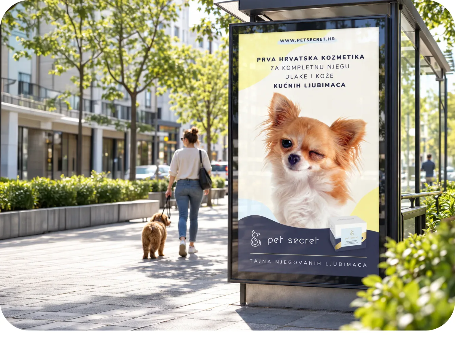
We developed its visual identity, packaging system, advertising campaign and website, creating a brand that combines the sophistication of premium skincare with a playful, approachable personality.
The Pet Secret logo combines the initials P and S into a delicate line illustration inspired by the shape of an animal.
We carried those initials into the brand's communication through a recurring P.S., introducing little notes about the products' secret ingredients.
It also plays on the familiar psst, as if someone were letting you in on a secret.
The colour palette takes inspiration from the blue and yellow hues that dogs can perceive, giving us a playful starting point for the brand's visual language.
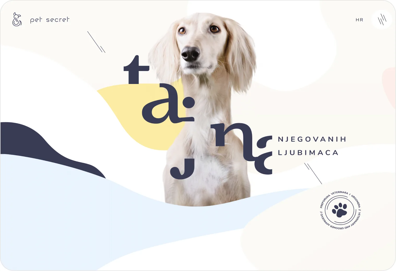
We extended this idea to the website, where images reveal an alternative blue-and-yellow interpretation, offering a little nod to how the world might look through a dog's eyes.
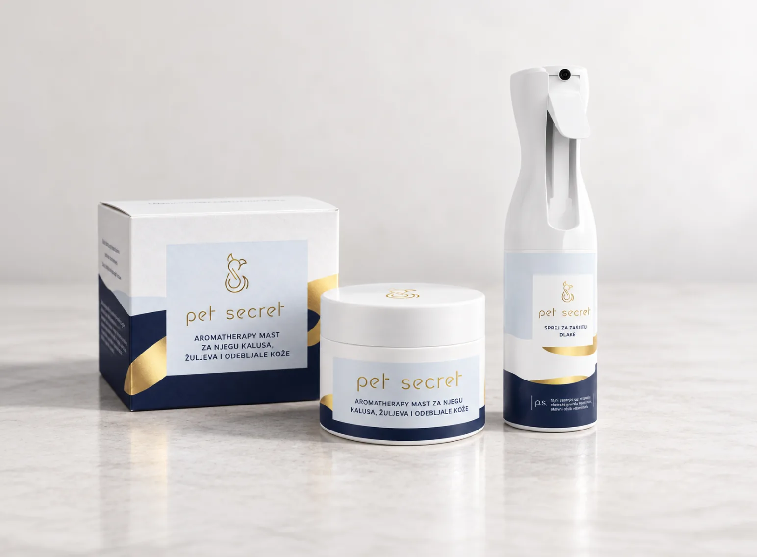
The packaging was designed as a flexible system that could accommodate a growing range of pet care products while maintaining a consistent identity.
The client's wish to incorporate gold foil stamping became an important part of the design. We combined it with soft blue and yellow tones, deep navy and flowing organic shapes, giving the packaging a premium finish without making it feel overly formal.
The result is a visual system that balances the elegance of a cosmetics brand with the warmth and playfulness of the pet care category.
webshop
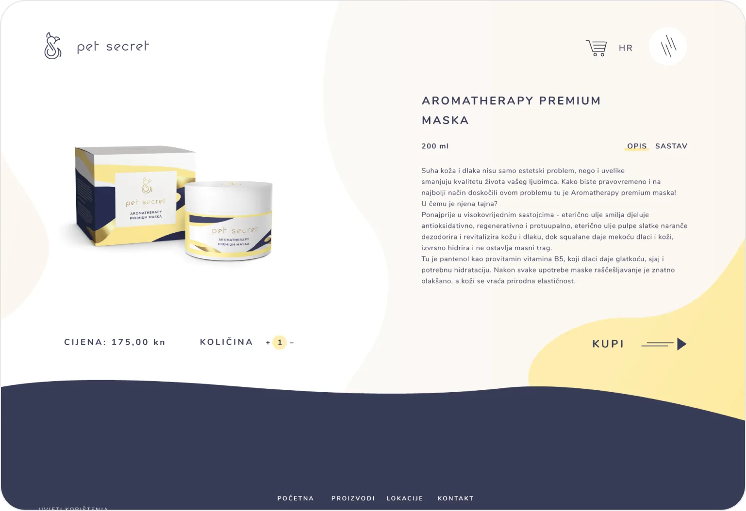
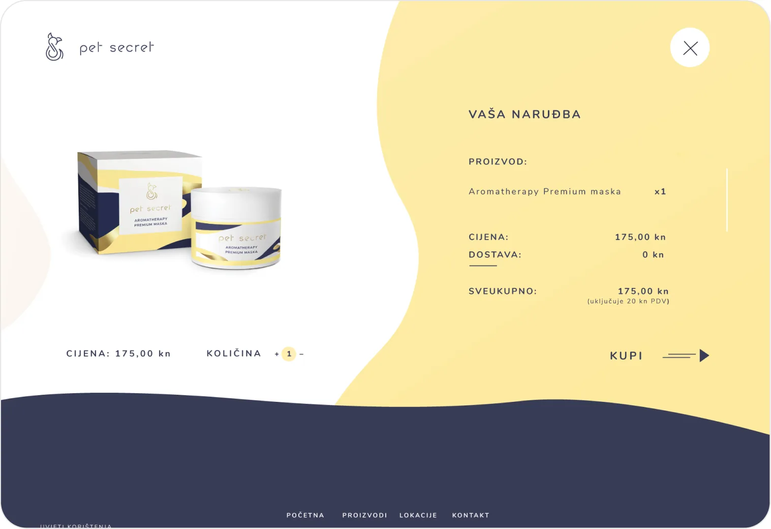
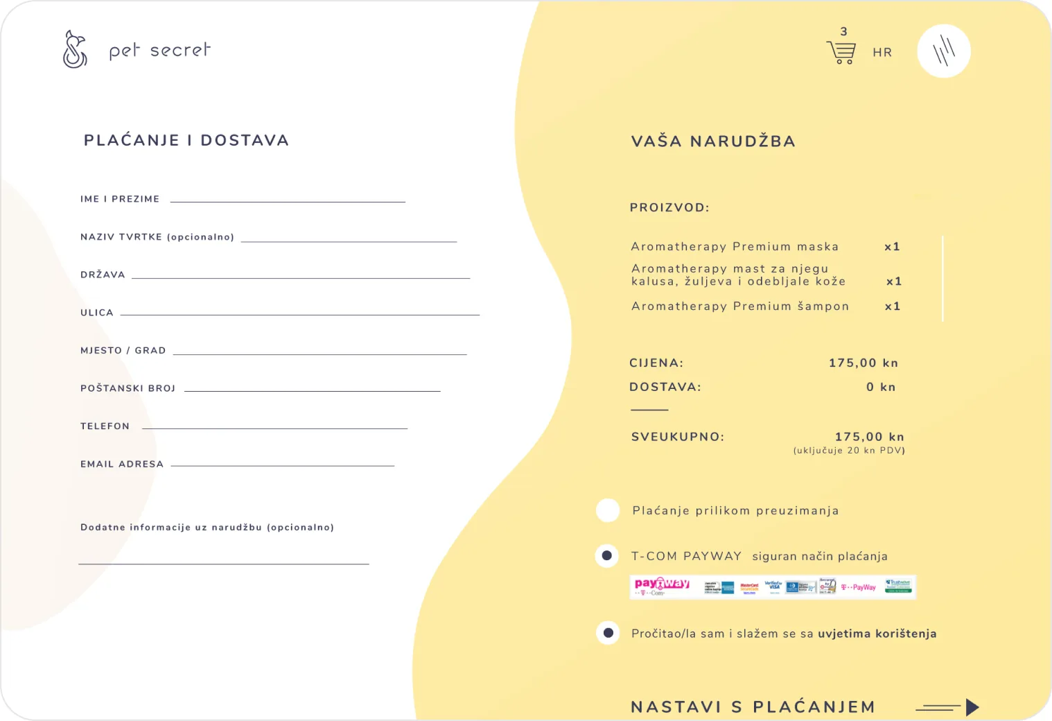
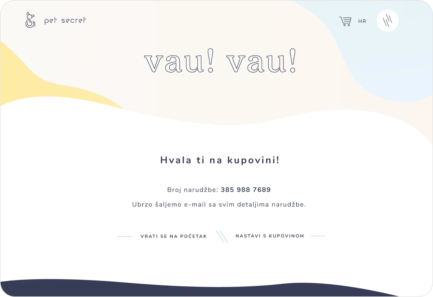
We carried the Pet Secret identity into a playful, interactive website and online shop, bringing together product discovery, pet care information and e-commerce.
The website's flowing, organic shapes, soft colours and playful typography create a visual experience that feels distinctly Pet Secret.
The design moves between generous white space, colourful backgrounds, photography and product presentations, with subtle animations adding movement throughout the page.
One of our favourite details was an interactive feature inspired by the way dogs perceive colour. Moving the cursor across the website revealed an alternative blue-and-yellow version of the imagery, offering visitors a playful glimpse into a dog's perspective.
The online shop followed the same visual language, presenting the product range in a clear, easy-to-browse layout while maintaining the character of the brand.