Makromikro group
Makromikro group is a retail company that equips offices and businesses.
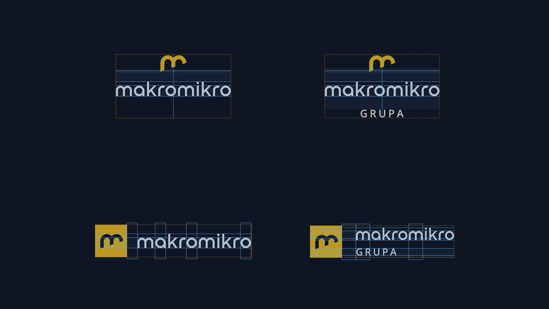
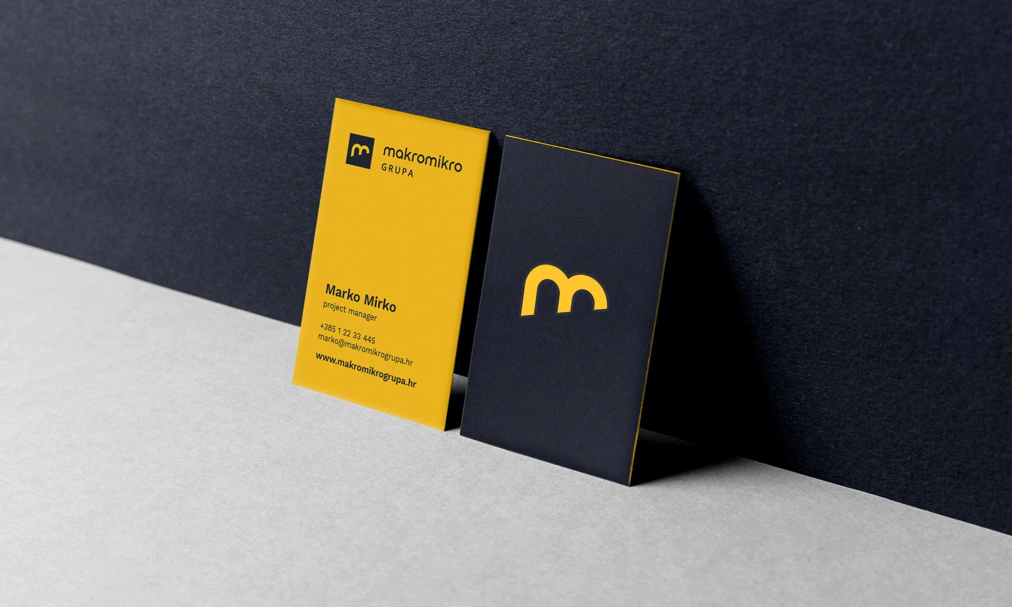
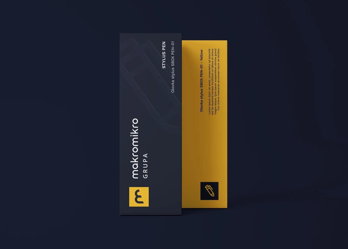
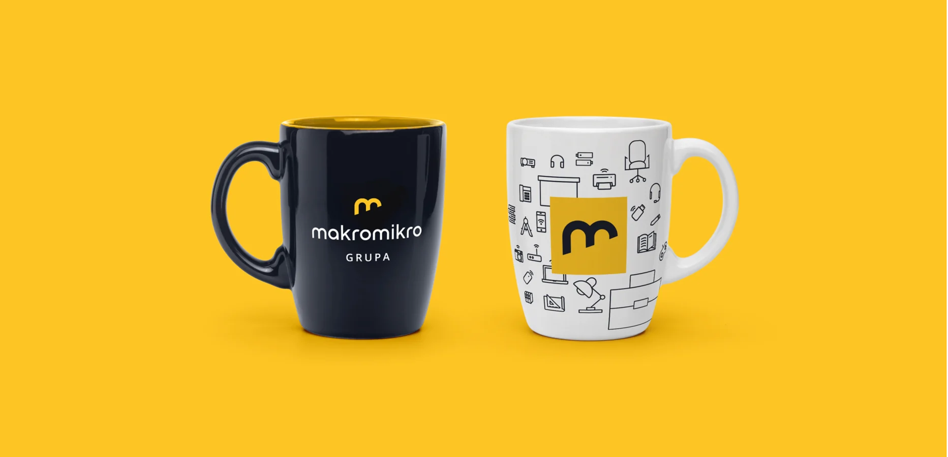
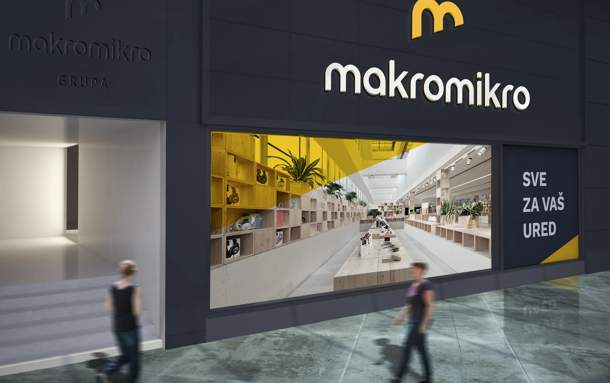
The rebrand, coming from the smiley old logo - gave them one modern, confident, more serious identity across every point of contact: stores and storefronts, delivery vans, work attire, merchandise, print and the website.

The name Makromikro (macro-micro) reads from big to small.
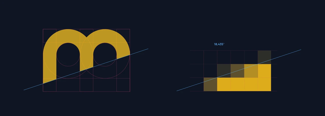
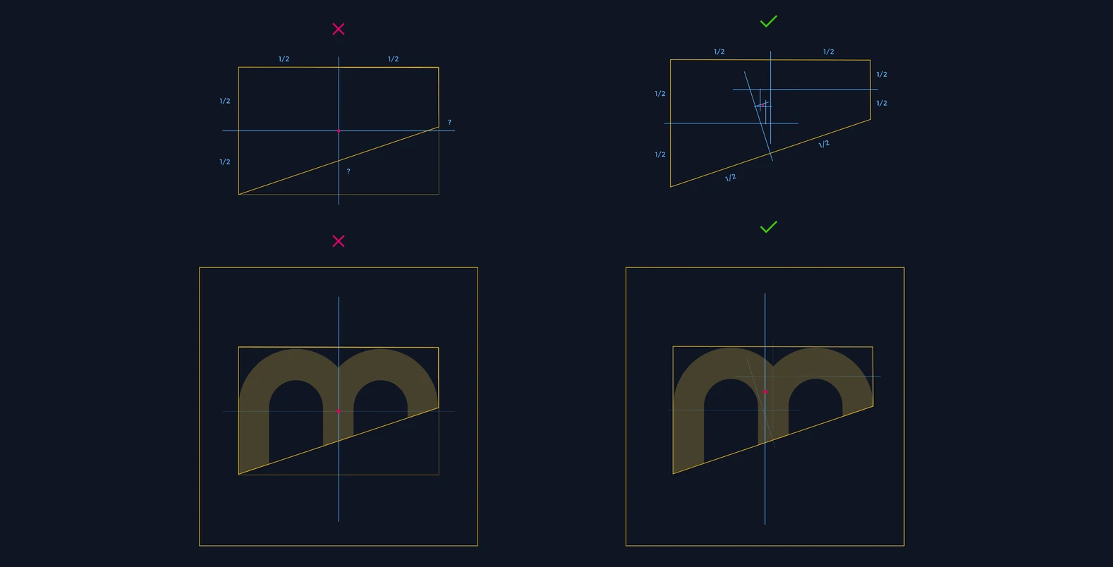
We turned that direction around: the mark is cut on a slant that rises from the bottom up, so it reads as growth, not decline.
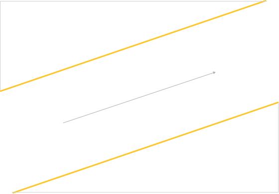
The angle of the cut is not arbitrary. It steps one pixel across for every three, so the edge stays crisp at every resolution, from a favicon to a storefront sign.
Because the left side of the mark carries more weight, its centre is corrected optically rather than geometrically.
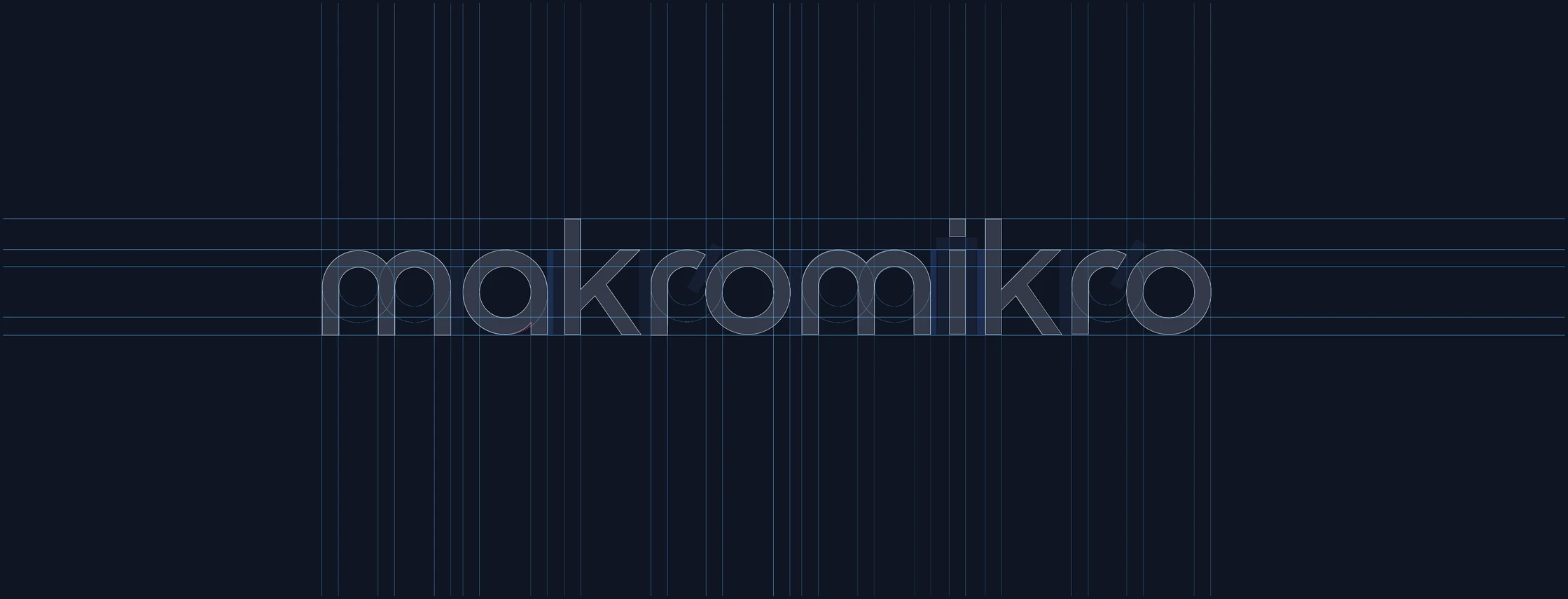
The lettering is custom drawn to match.
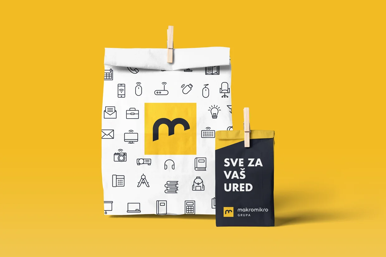
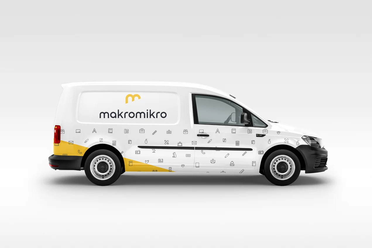
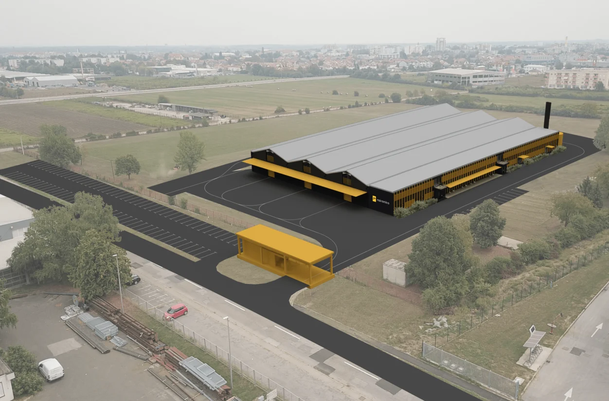
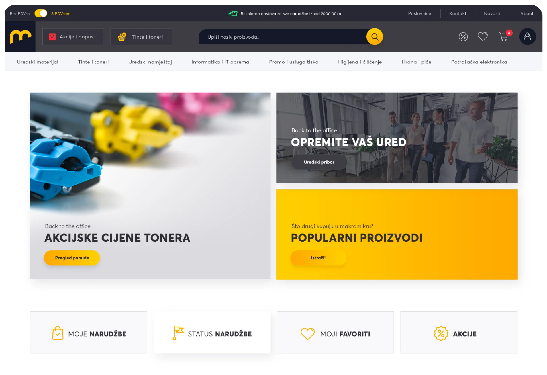
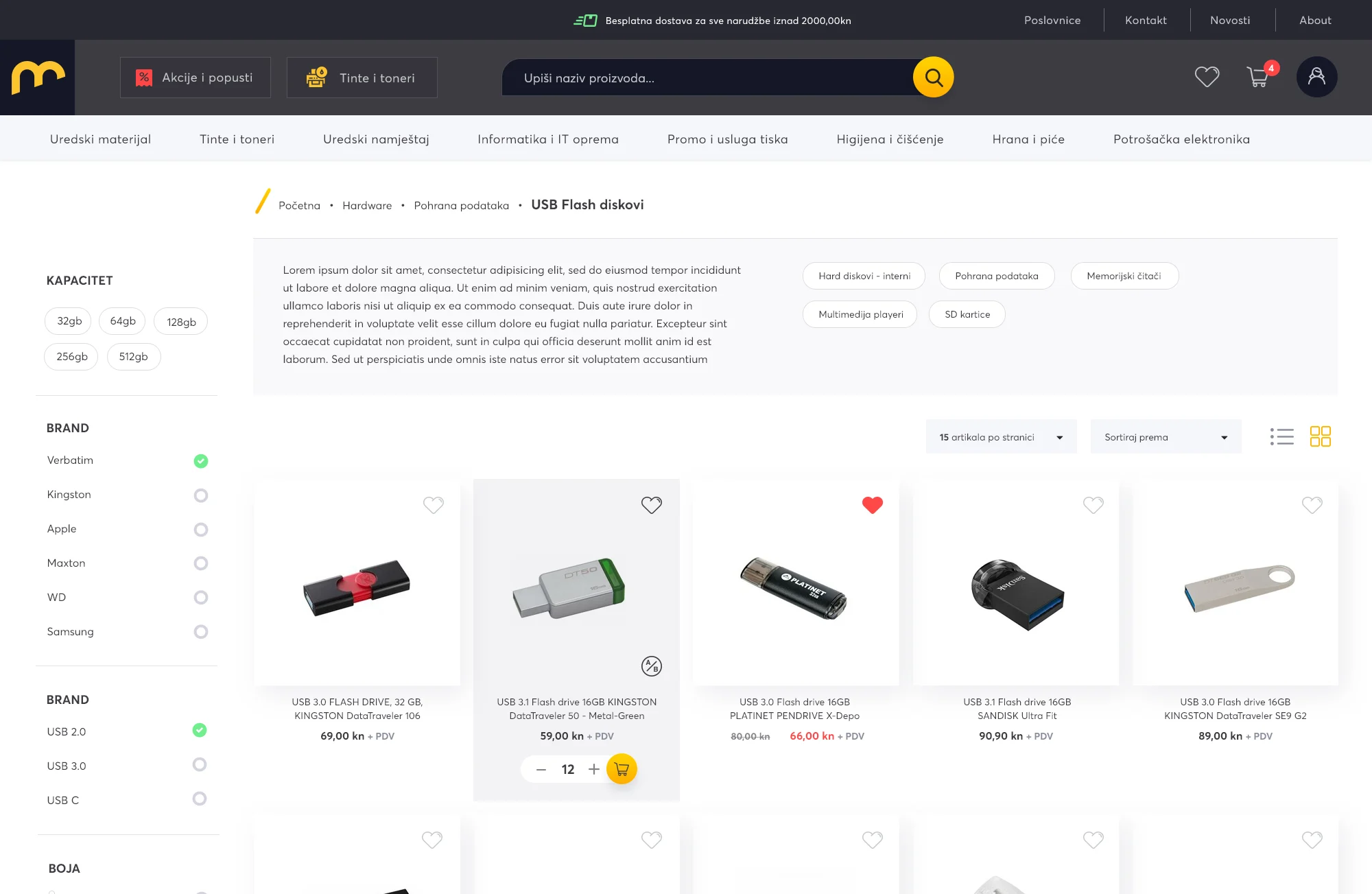
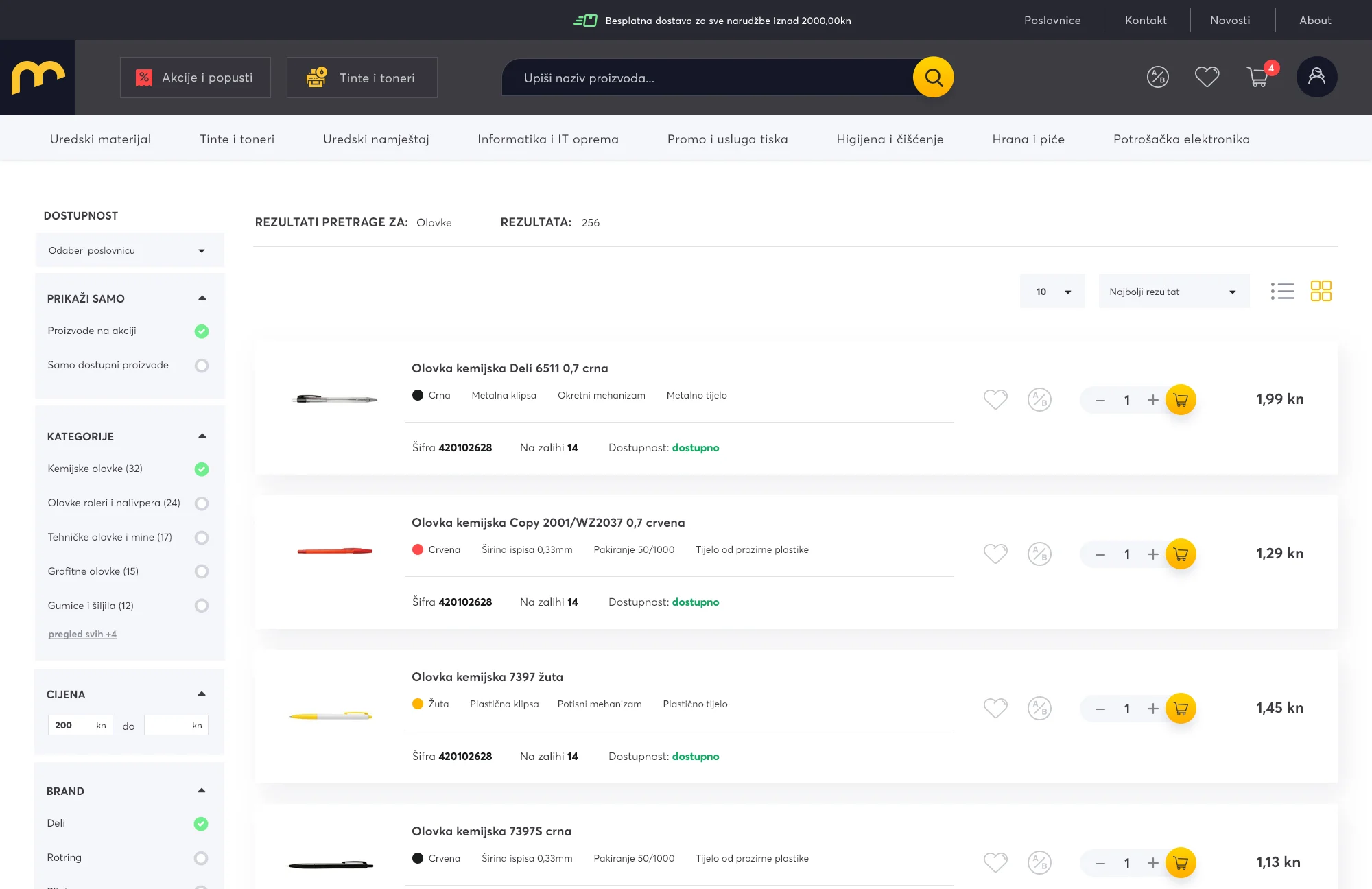
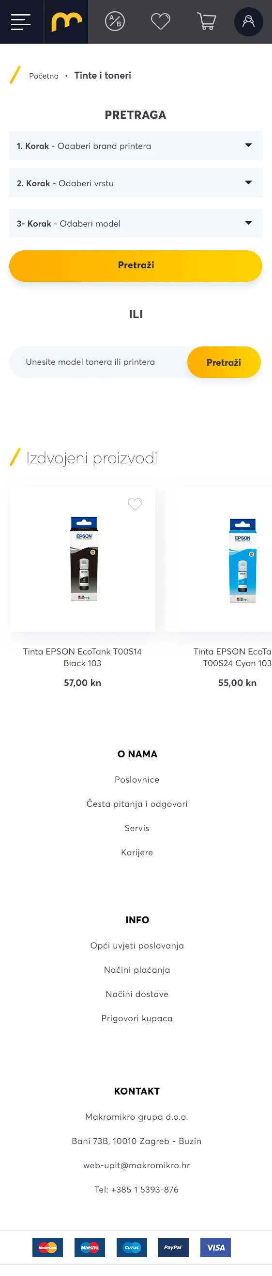
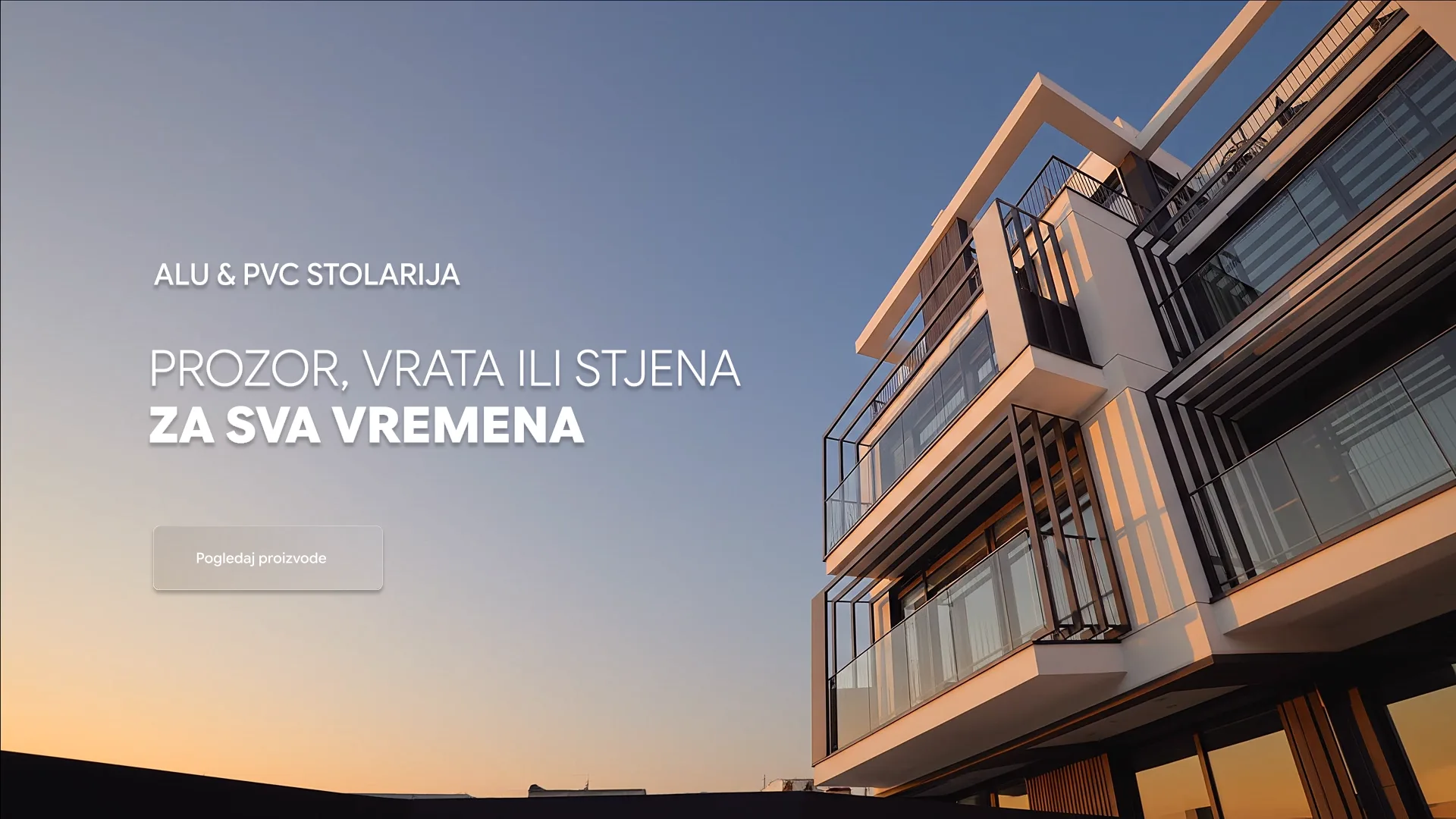
The website carries the identity online: bold yellow and deep navy, clear product categories and a layout built for browsing the whole range on desktop and mobile.